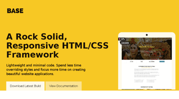
Lightweight and minimal code. Spend less time overriding styles and focus more time on creating beautiful website applications.
Welcome to Base!
Whether you’re building a new web application from scratch or creating a mobile-first, responsive website, Base is very easy to learn and use.
Getting started
Before diving into Base, please make sure you have the following tools and basic knowledge:
- Good understanding of HTML and CSS
- A good code editor such as Sublime Text Editor
- Latest installation of Node and NPM
- A calm and open mind 🙂
Installation
If you are creating a new project from scratch, it is highly recommended you download the base starter template.
Or you can clone the starter-template directly:
git clone https://github.com/matthewhartman/base-starter.git yourwebsite && cd yourwebsite && rm -rf .git npm install && npm startAlternatively, if you have an existing project, simply install base using NPM:
npm install --save getbaseOnce you have Base installed, you can include it into your website with one of the following methods:
Reference the CSS file directly into your website:
<link rel="stylesheet" href="node_modules/getbase/css/styles.css"/>Import via SCSS file:
@import "node_modules/getbase/scss/base";

// Your website styles

@import "node_modules/getbase/scss/base/_helpers";
Import via LESS file:
@import "node_modules/getbase/less/base";

// Your website styles

@import "node_modules/getbase/scss/less/_helpers";
Grid
A mobile-first, 12 column grid built for all devices big and small. The syntax is simple and it works on all major browsers including Chrome, Safari, Firefox and Internet Explorer 8+.
Overview
Base includes a flexible, 12-column grid that scales and supports nesting so you can get started right away.
Creating a grid
- Create a new element with the class
.clearapplied to ensure the grid columns are grouped and cleared correctly. - Columns can be created by adding new elements within
.clearand applying appropriate column classes (.col-1–.col-12).
Base is mobile-first, so code for small screens first, and larger devices will inherit those styles.
By default, Base caters for 4 viewports:
- Mobile devices (breakpoint set at max 719px width)
- Tablet devices (breakpoint set at max 980px width)
- Desktop devices (breakpoint set at max 1140px width)
- HD devices
Containers
There are 2 types of containers:
.container– has a set width, is center aligned and applies a 15px gutter padding (left and right).container-full– sets width to auto, is center aligned and applies a 15px gutter padding (left and right)
Animations
Check out the cool animations to give your website that pop!


0 Comments