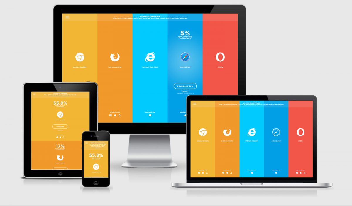
In Responsive Design, we learned how to use media queries to create separate mobile, tablet, and desktop layouts. Now, we’re going to add images to the mix. Just as media queries let us conditionally present different CSS rules, we want to display different images based on the user’s device.
Categories: Lessons - Snippets


0 Comments