A dead simple, responsive boilerplate.
THE GRID
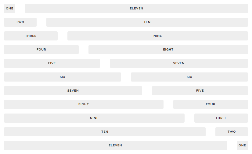
The grid is a 12-column fluid grid with a max width of 960px, that shrinks with the browser/device at smaller sizes. The max width can be changed with one line of CSS and all columns will resize accordingly. The syntax is simple and it makes coding responsive much easier. Go ahead, resize the browser.
<!-- .container is main centered wrapper -->
<div class="container">

  <!-- columns should be the immediate child of a .row -->
  <div class="row">
    <div class="one column">One</div>
    <div class="eleven columns">Eleven</div>
  </div>

  <!-- just use a number and class 'column' or 'columns' -->
  <div class="row">
    <div class="two columns">Two</div>
    <div class="ten columns">Ten</div>
  </div>

  <!-- there are a few shorthand columns widths as well -->
  <div class="row">
    <div class="one-third column">1/3</div>
    <div class="two-thirds column">2/3</div>
  </div>
  <div class="row">
    <div class="one-half column">1/2</div>
    <div class="one-half column">1/2</div>
  </div>

</div>

<!-- Note: columns can be nested, but it's not recommended since Skeleton's grid has %-based gutters, meaning a nested grid results in variable with gutters (which can end up being *really* small on certain browser/device sizes) -->
TYPOGRAPHY
Type is all set with the rems , so font-sizes and spacial relationships can be responsively sized based on a single html font-size property. Out of the box, Skeleton never changes the html font-size, but it’s there in case you need it for your project. All measurements are still base 10 though
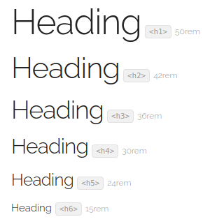
so, an h1 with 5.0rem font-size just means 50px .
The typography base is Raleway served by Google, set at 15rem (15px) over a 1.6 line height (24px). Other type basics like anchors, strong, emphasis, and underline are all obviously included.
Headings create a family of distinct sizes each with specific letter-spacing , line-height and margins .
<!-- Standard Headings -->
<h1>Heading</h1>
<h2>Heading</h2>
<h3>Heading</h3>
<h4>Heading</h4>
<h5>Heading</h5>
<h6>Heading</h6>

<!-- Base type size -->
<p>The base type is 15px over 1.6 line height (24px)</p>

<!-- Other styled text tags -->
<strong>Bolded</strong>
<em>Italicized</em>
<a>Colored</a>
<u>Underlined</u>
BUTTONS
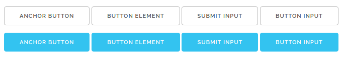
Buttons come in two basic flavors in Skeleton. The standard button element is plain, whereas the .button-primary button is vibrant and prominent. Button styles are applied to a number of appropriate form elements, but can also be arbitrarily attached to anchors with a .button class.
<!-- Standard buttons -->
<a class="button" href="#">Anchor button</a>
<button>Button element</button>
<input type="submit" value="submit input">
<input type="button" value="button input">

<!-- Primary buttons -->
<a class="button button-primary" href="#">Anchor button</a>
<button class="button-primary">Button element</button>
<input class="button-primary" type="submit" value="submit input">
<input class="button-primary" type="button" value="button input">
FORMS
Forms are a huge pain, but hopefully these styles make it a bit easier. All inputs, select, and buttons are normalized for a common height cross-browser so inputs can be stacked or placed alongside each other.
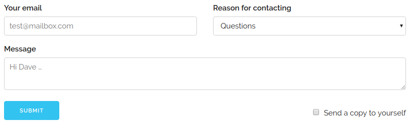
<!-- The above form looks like this -->
<form>
  <div class="row">
    <div class="six columns">
      <label for="exampleEmailInput">Your email</label>
      <input class="u-full-width" type="email" placeholder="test@mailbox.com" id="exampleEmailInput">
    </div>
    <div class="six columns">
      <label for="exampleRecipientInput">Reason for contacting</label>
      <select class="u-full-width" id="exampleRecipientInput">
        <option value="Option 1">Questions</option>
        <option value="Option 2">Admiration</option>
        <option value="Option 3">Can I get your number?</option>
      </select>
    </div>
  </div>
  <label for="exampleMessage">Message</label>
  <textarea class="u-full-width" placeholder="Hi Dave …" id="exampleMessage"></textarea>
  <label class="example-send-yourself-copy">
    <input type="checkbox">
    <span class="label-body">Send a copy to yourself</span>
  </label>
  <input class="button-primary" type="submit" value="Submit">
</form>

<!-- Always wrap checkbox and radio inputs in a label and use a <span class="label-body"> inside of it -->

<!-- Note: The class .u-full-width is just a utility class shorthand for width: 100% -->
Lists
- Unordered lists have basic styles
- They use the circle list style
- Nested lists styled to feel right
- Can nest either type of list into the other
- Just more list items mama san
- Ordered lists also have basic styles
- They use the decimal list style
- Ordered and unordered can be nested
- Can nest either type of list into the other
- Last list item just for the fun
<table class="u-full-width">
  <thead>
    <tr>
      <th>Name</th>
      <th>Age</th>
      <th>Sex</th>
      <th>Location</th>
    </tr>
  </thead>
  <tbody>
    <tr>
      <td>Dave Gamache</td>
      <td>26</td>
      <td>Male</td>
      <td>San Francisco</td>
    </tr>
    <tr>
      <td>Dwayne Johnson</td>
      <td>42</td>
      <td>Male</td>
      <td>Hayward</td>
    </tr>
  </tbody>
</table>
TABLES
Be sure to use properly formed table markup with div and /div
when building a table.
| Name | Age | Sex | Location |
|---|---|---|---|
| Dave Gamache | 26 | Male | San Francisco |
| Dwayne Johnson | 42 | Male | Hayward |
<ul>
  <li>Item 1</li>
  <li>
    Item 2
    <ul>
      <li>Item 2.1</li>
      <li>Item 2.2</li>
    </ul>
  </li>
  <li>Item 3</li>
</ul>

<!-- Easily substitute any <ul> or an <ol> to get number lists or sublists. Skeleton doesn't support lists nested deeper than 2 levels -->
MEDIA QUERIES
Skeleton uses media queries to serve its scalable grid, but also has a list of queries for convenience of styling your site across devices. The queries are mobile-first, meaning they target min-width . Mobile-first queries are how Skeleton’s grid is built and is the preferrable method of organizing CSS. It means all styles outside of a query apply to all devices, then larger devices are targeted for enhancement. This prevents small devices from having to parse tons of unused CSS. The sizes for the queries are:
- Desktop HD: 1200px
- Desktop: 1000px
- Tablet: 750px
/* Mobile first queries */

/* Larger than mobile */
@media (min-width: 400px) {}

/* Larger than phablet */
@media (min-width: 550px) {}

/* Larger than tablet */
@media (min-width: 750px) {}

/* Larger than desktop */
@media (min-width: 1000px) {}

/* Larger than Desktop HD */
@media (min-width: 1200px) {}
UTILITIES
Skeleton has a number of small utility classes that act as easy-to-use helpers. Sometimes it’s better to use a utility class than create a whole new class just to float an element.
/* Utility Classes */

/* Make element full width */
.u-full-width {
  width: 100%;
  box-sizing: border-box; }

/* Make sure elements don't run outside containers (great for images in columns) */
.u-max-full-width {
  max-width: 100%;
  box-sizing: border-box; }

/* Float either direction */
.u-pull-right {
  float: right; }
.u-pull-left {
  float: left; }

/* Clear a float */
.u-cf {
  content: "";
  display: table;
  clear: both; }


0 Comments