Lessons - Snippets
Responsive design for picture element
In Responsive Design, we learned how to use media queries to create separate mobile, tablet, and desktop layouts. Now, we’re going to add images to the mix. Just as media queries let us conditionally present different CSS rules, we want to display different images based on the user’s device.
Lessons - Snippets
Introduction to Canvas
The HTML <canvas> element is used to draw graphics, on the fly, via scripting (usually JavaScript). The <canvas> element is only a container for graphics. You must use a script to actually draw the graphics. Canvas has several methods for drawing paths, boxes, circles, text, and adding images.
Lessons - Snippets
HTML5 Special tags
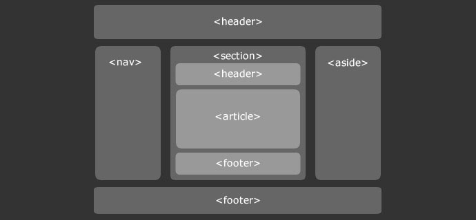
HTML5 brings a host of new elements and attributes to allow developers to make their documents more easily understood by other systems (especially search engines!), display data more uniquely, and take on some of the load that has required complex JavaScript or browser plug-ins like Flash and Silverlight to handle.
Lessons - Snippets
Responsive Web Design
Responsive Web Design The Internet took off quicker than anyone would have predicted, growing like crazy. Now, for the past few years, mobile growth has exploded onto the scene. The growth of mobile Internet usage is also far out pacing that of general Internet usage growth. With the growth in Read more…
Lessons - Snippets
HTML CSS3 responsive-design
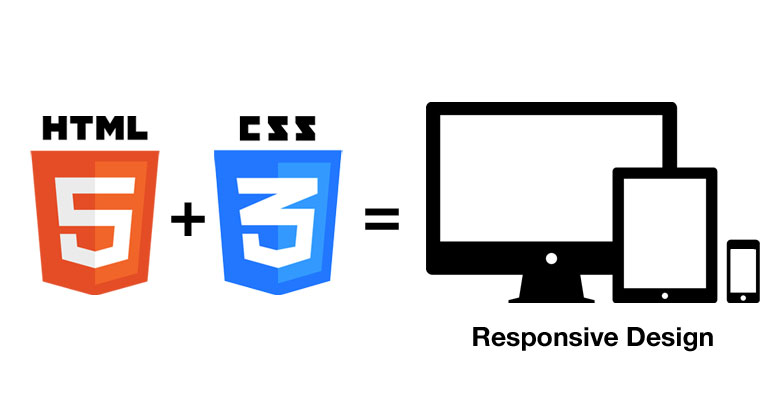
What is Responsive Web Design? Responsive web design makes your web page look good on all devices. Responsive web design uses only HTML and CSS. Responsive web design is not a program or a JavaScript. Designing For The Best Experience For All Users Web pages can be viewed using many Read more…


